Für Luise Für Marie
Marie Walser
Luise Schaller
Luise Schaller
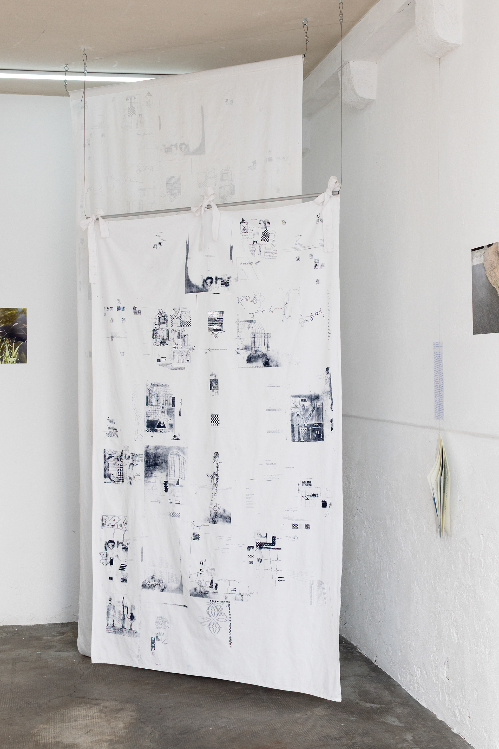
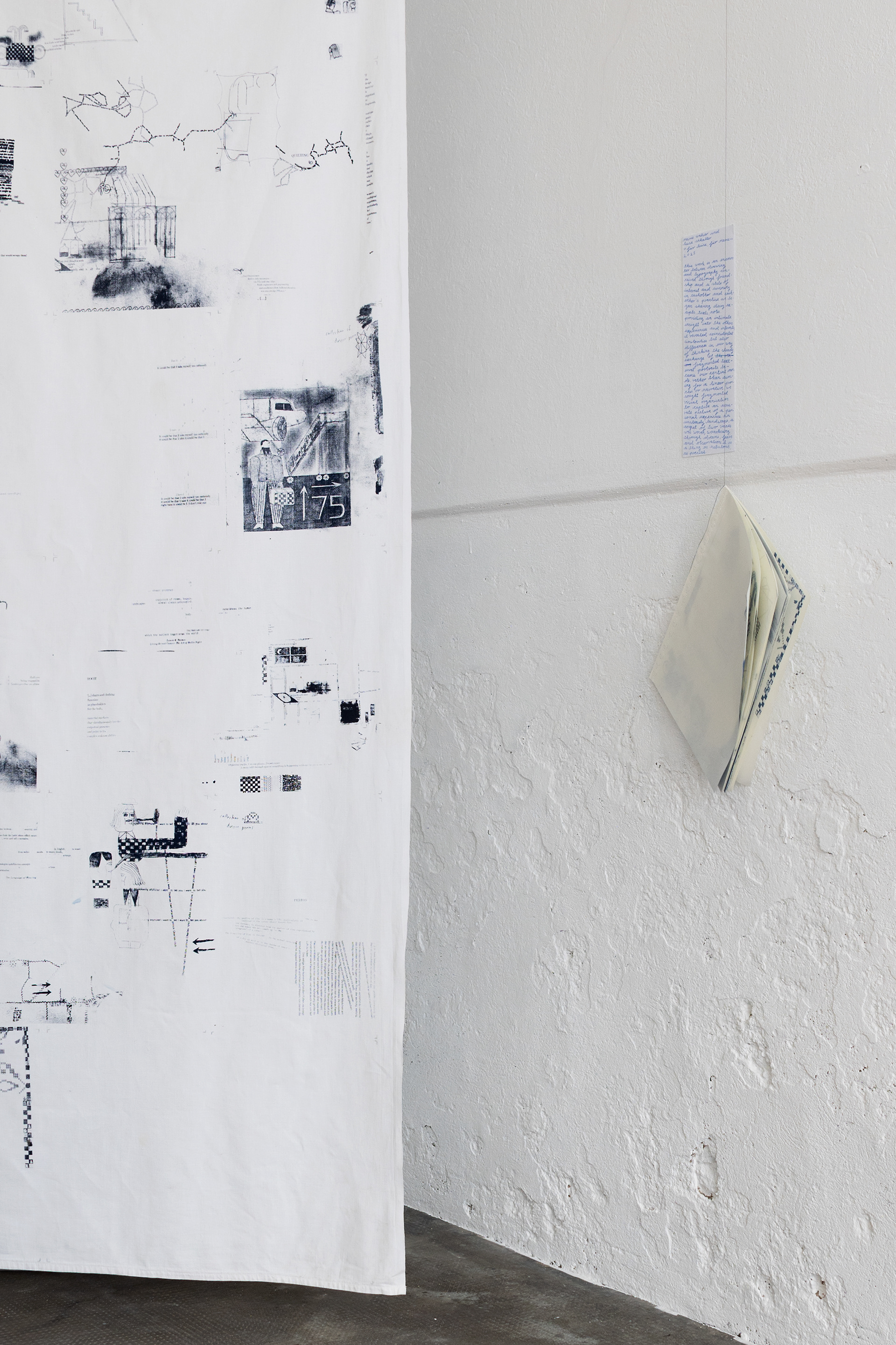
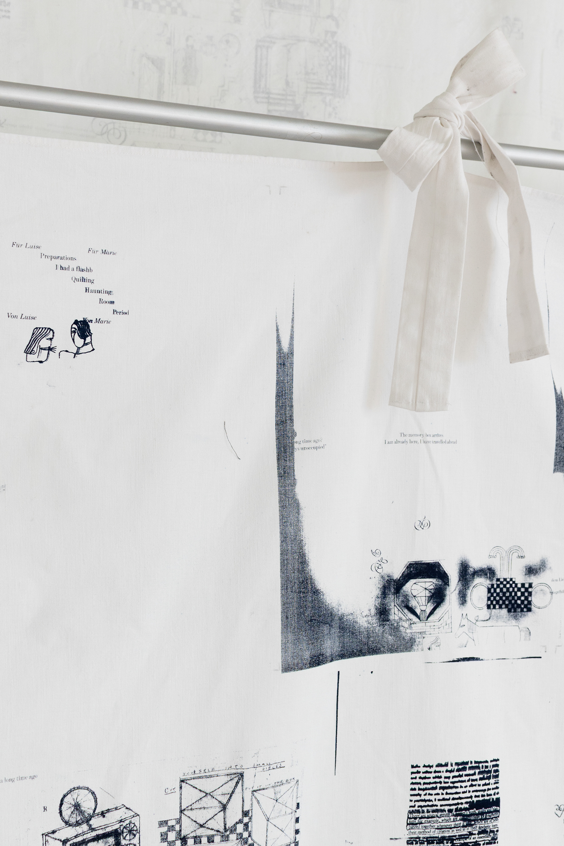
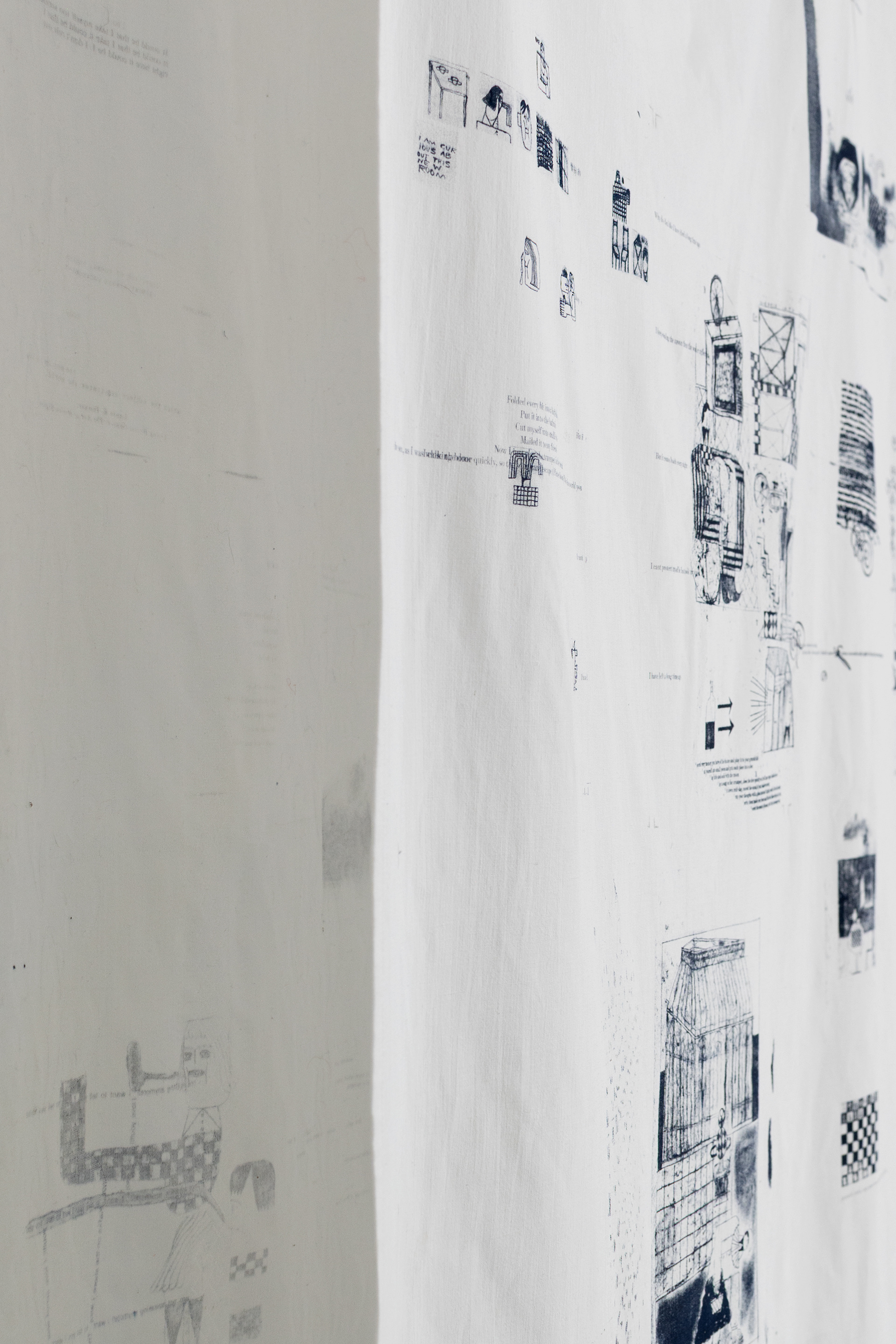
"For Luise, for Marie" is a work that engages with entanglement and weaving in the context of text, drawing, typography, and experimental publication.
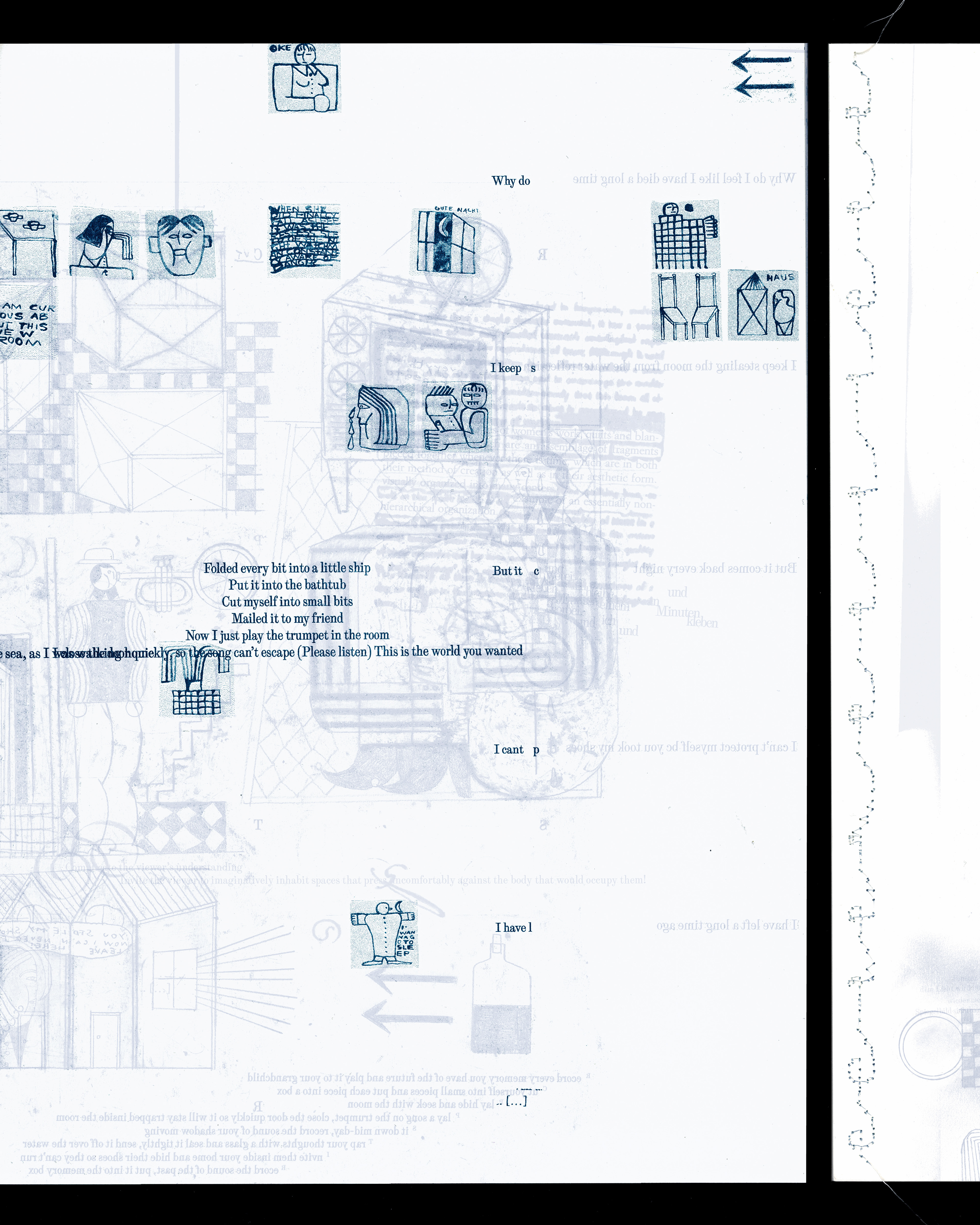
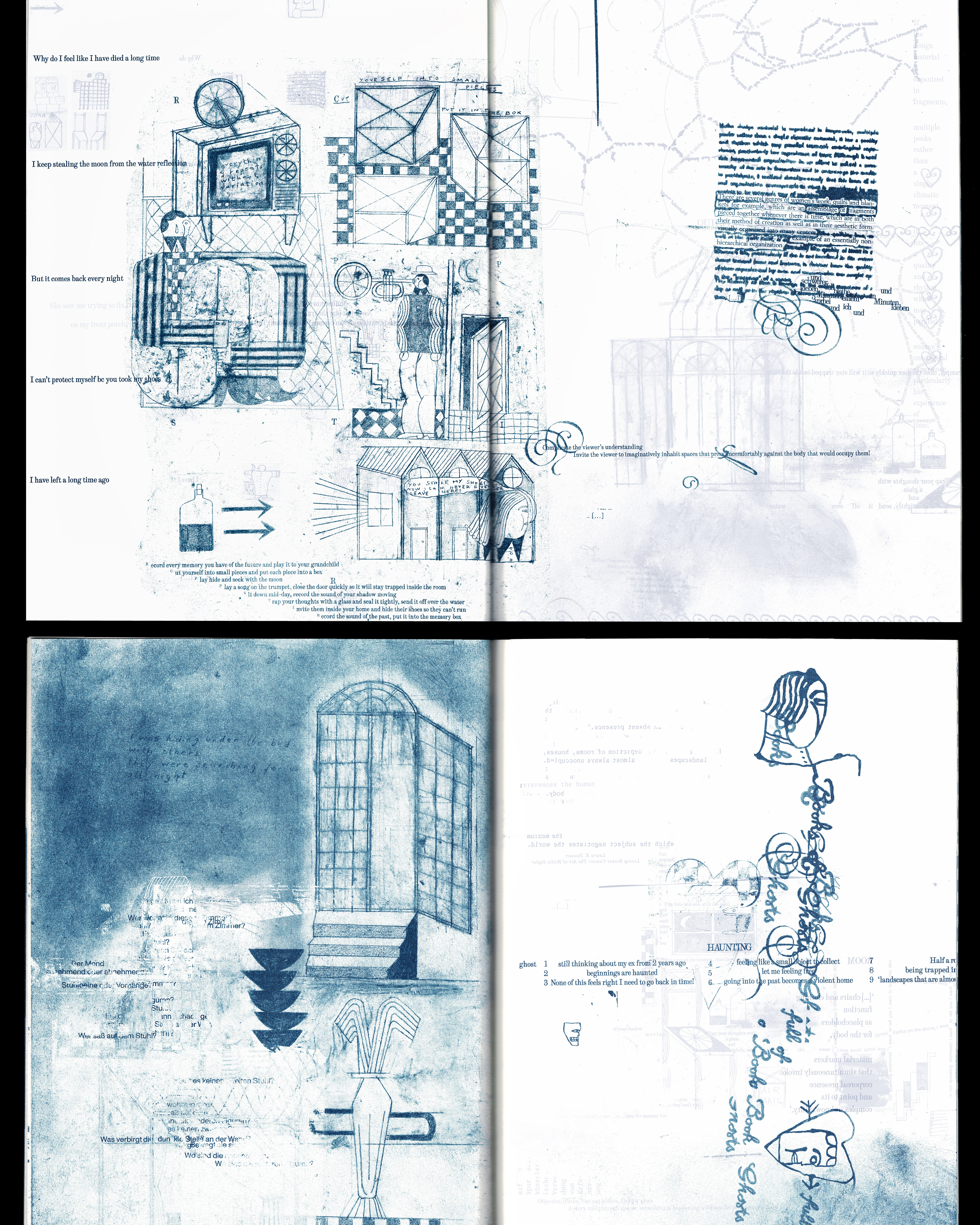
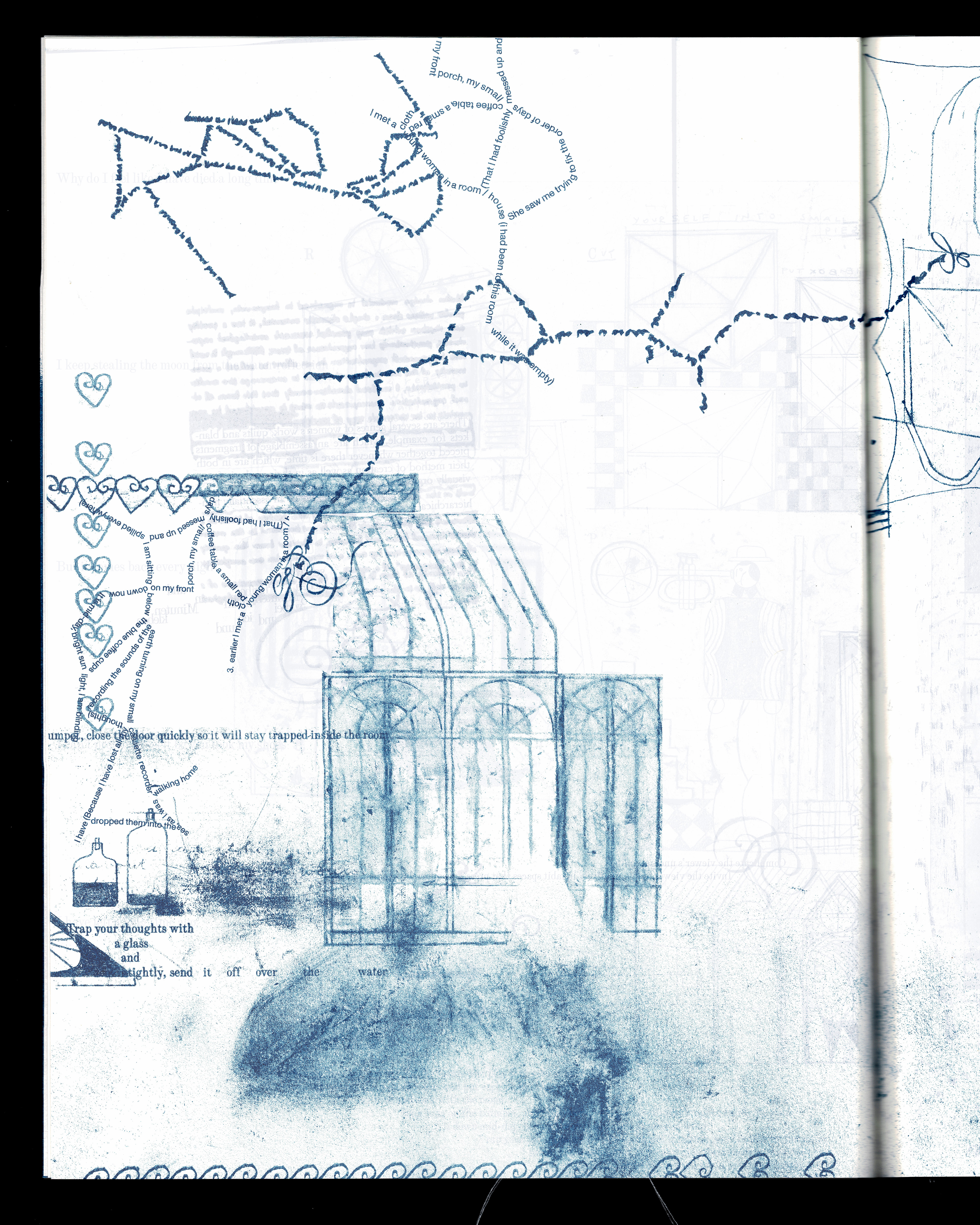
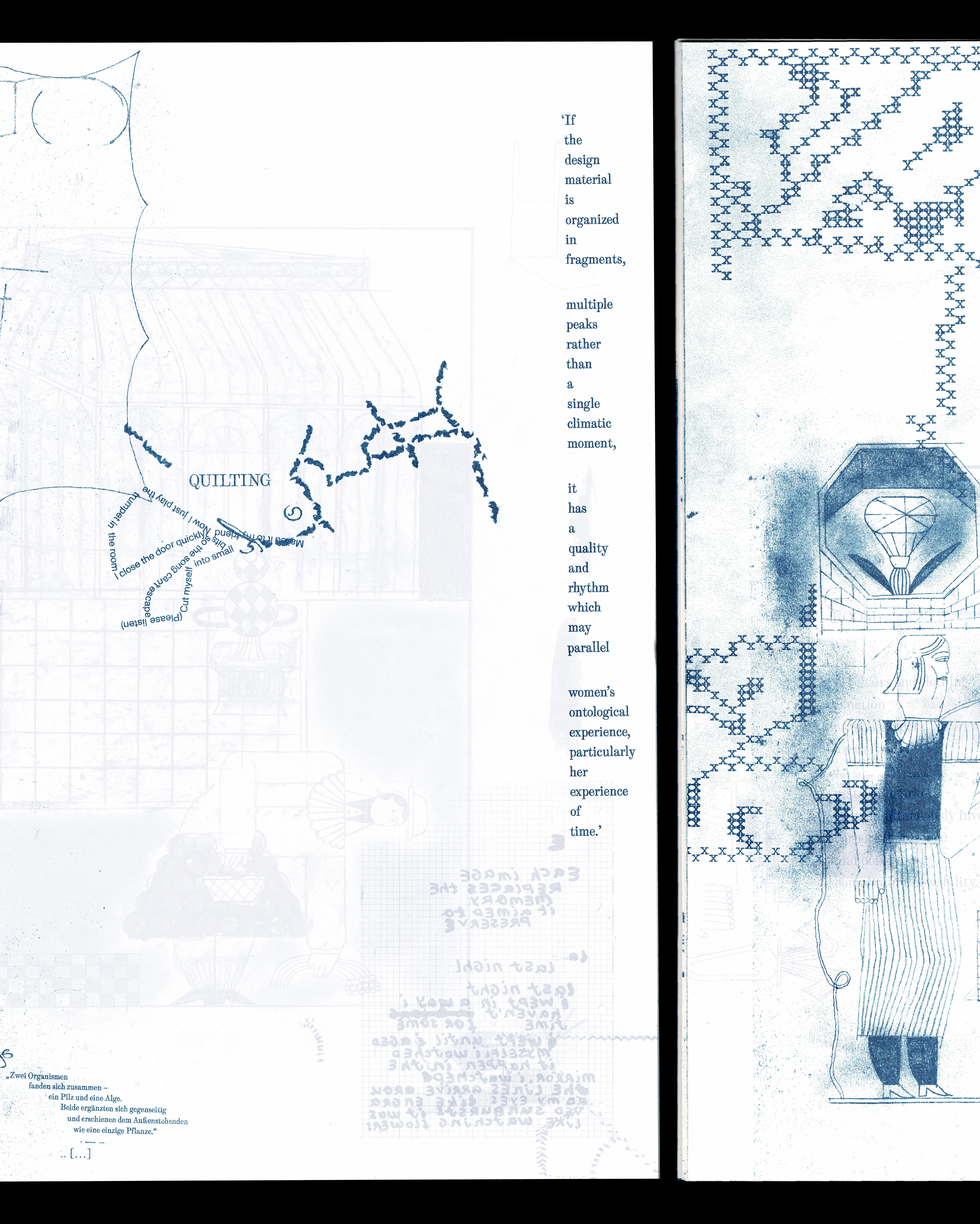
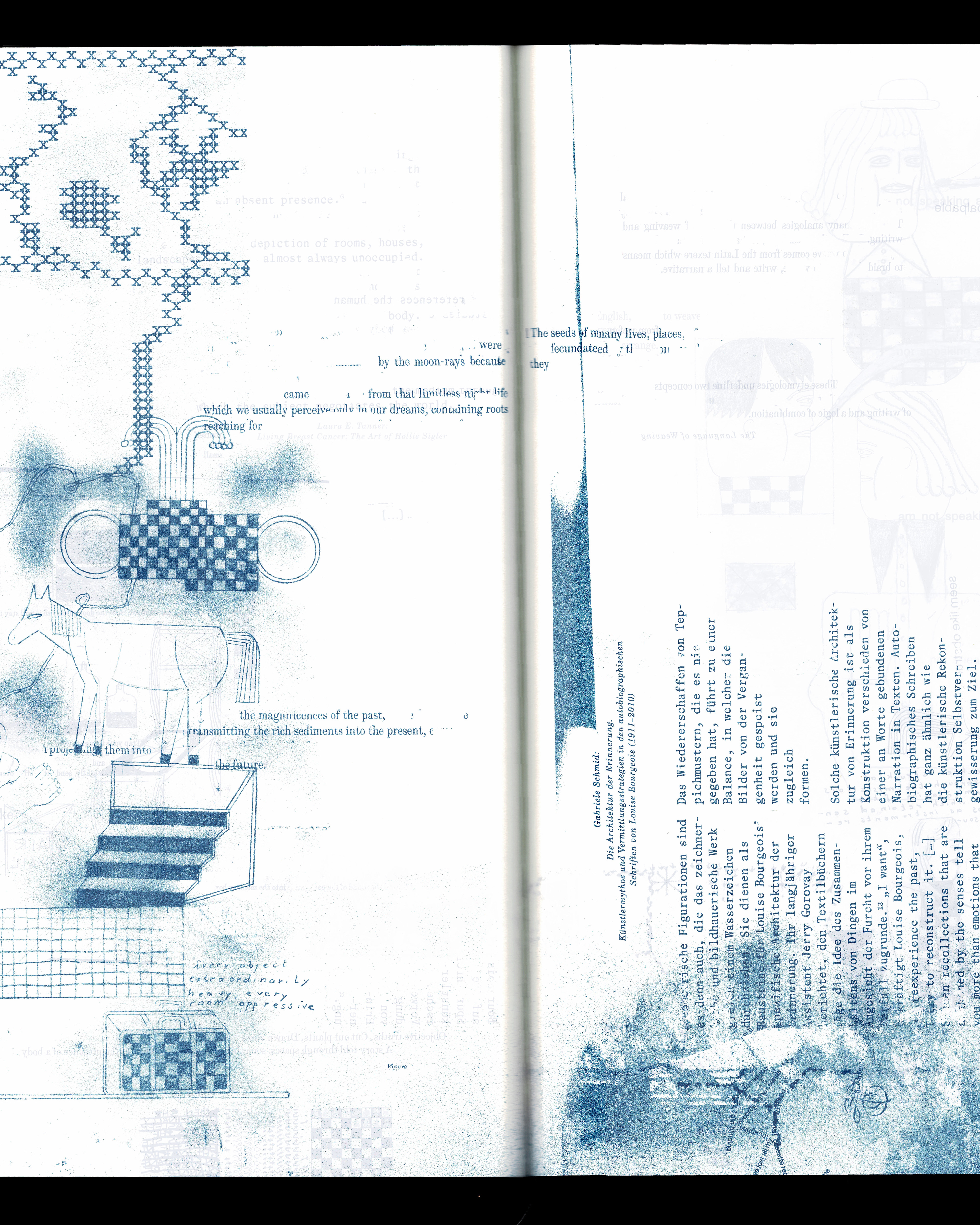
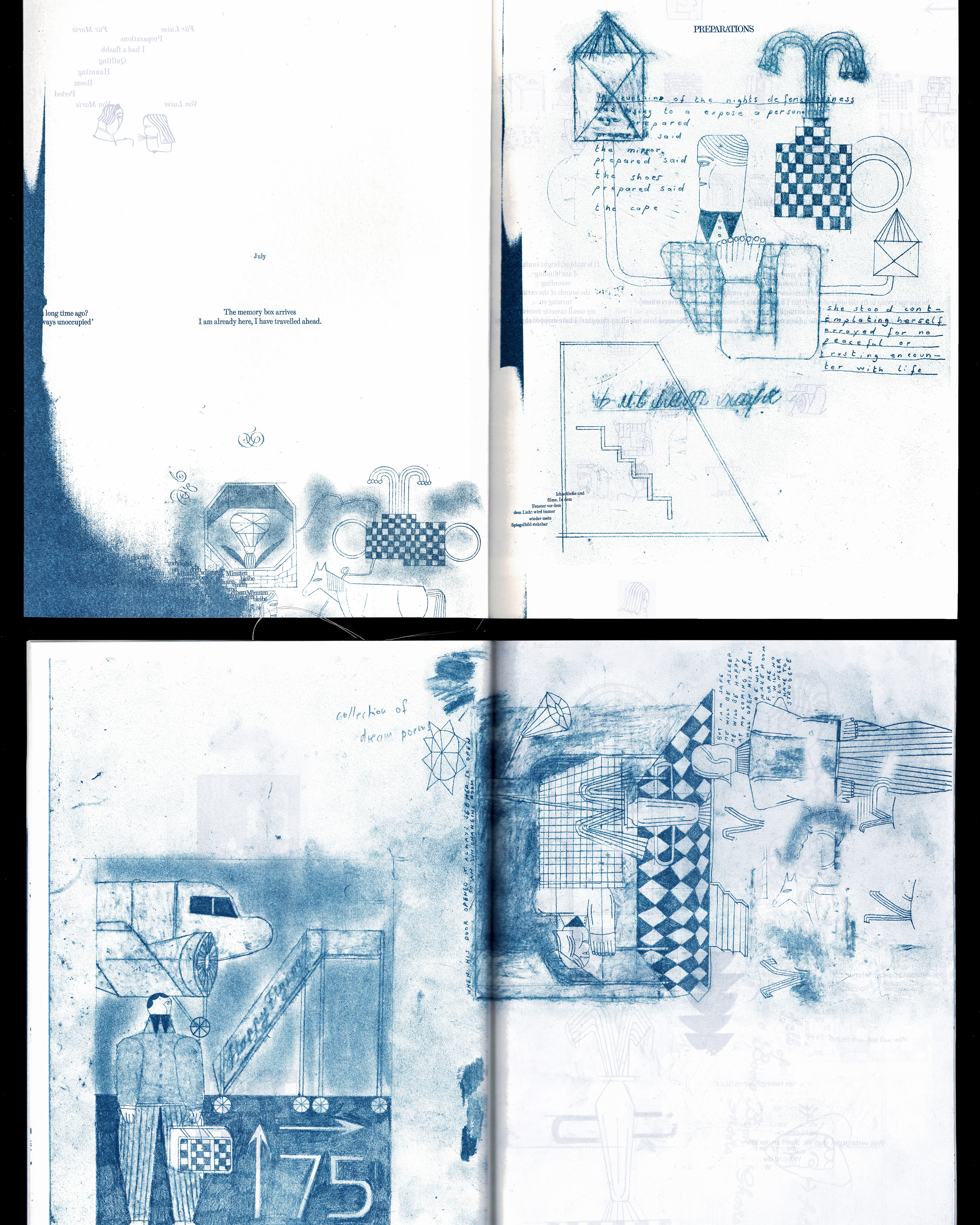
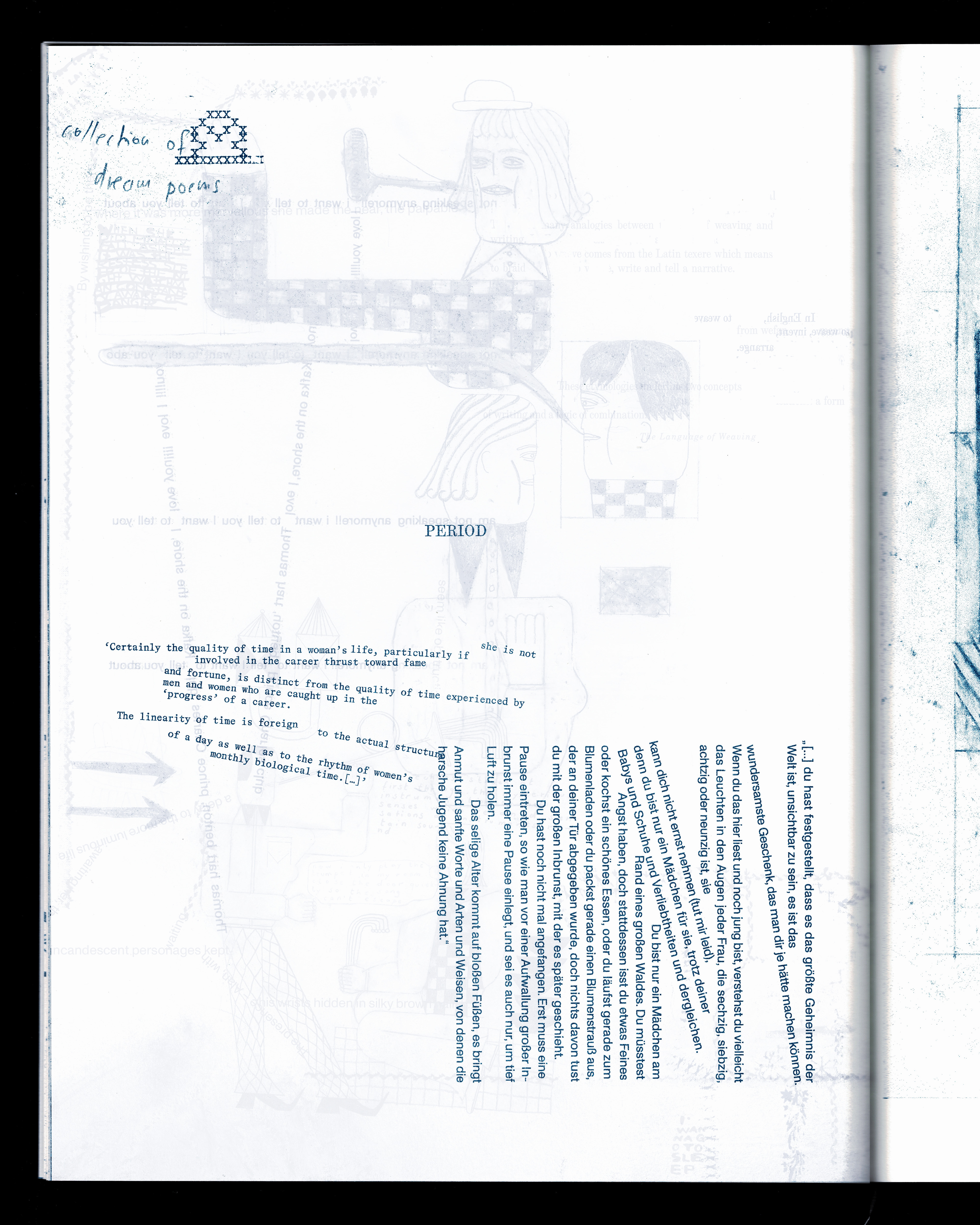
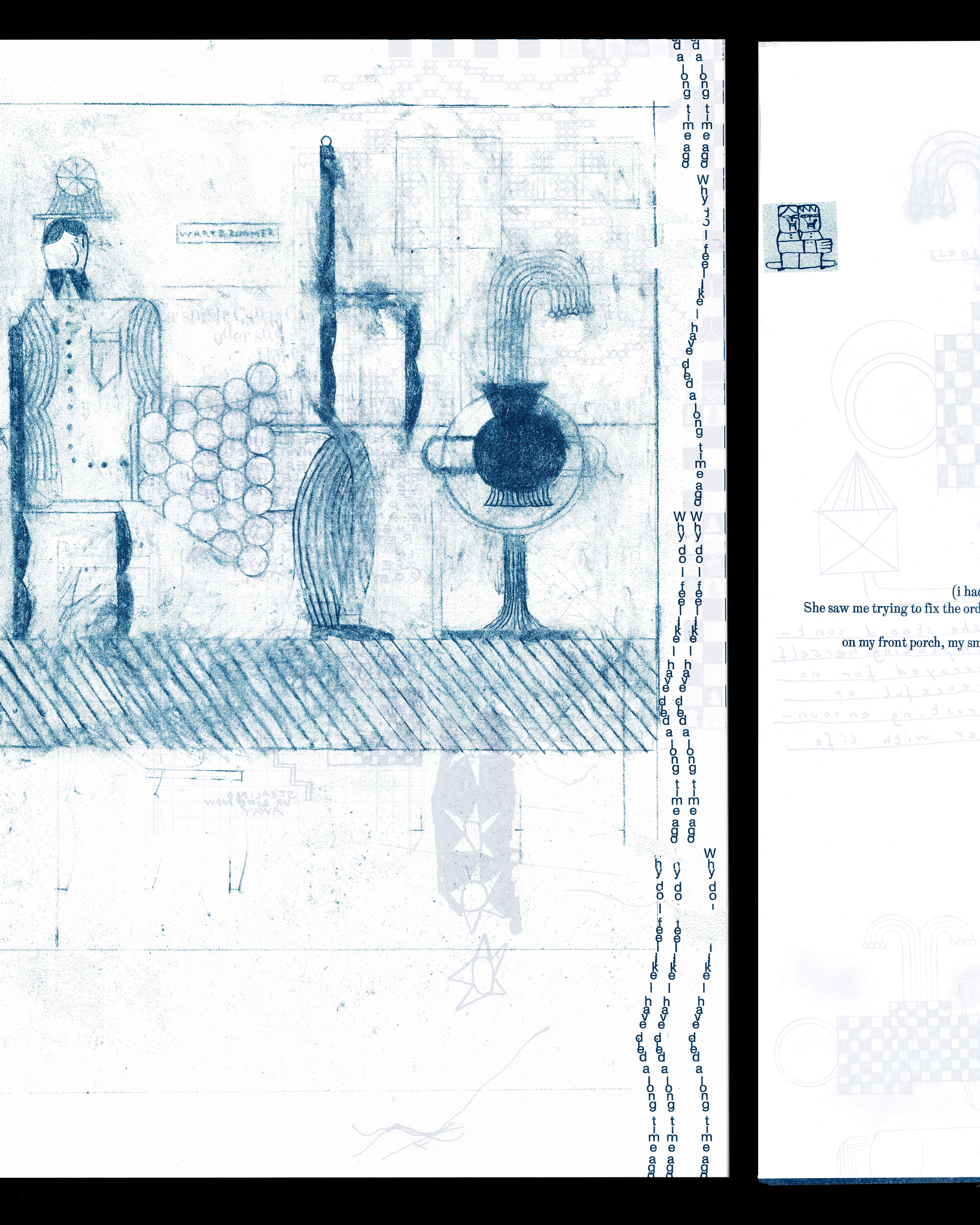
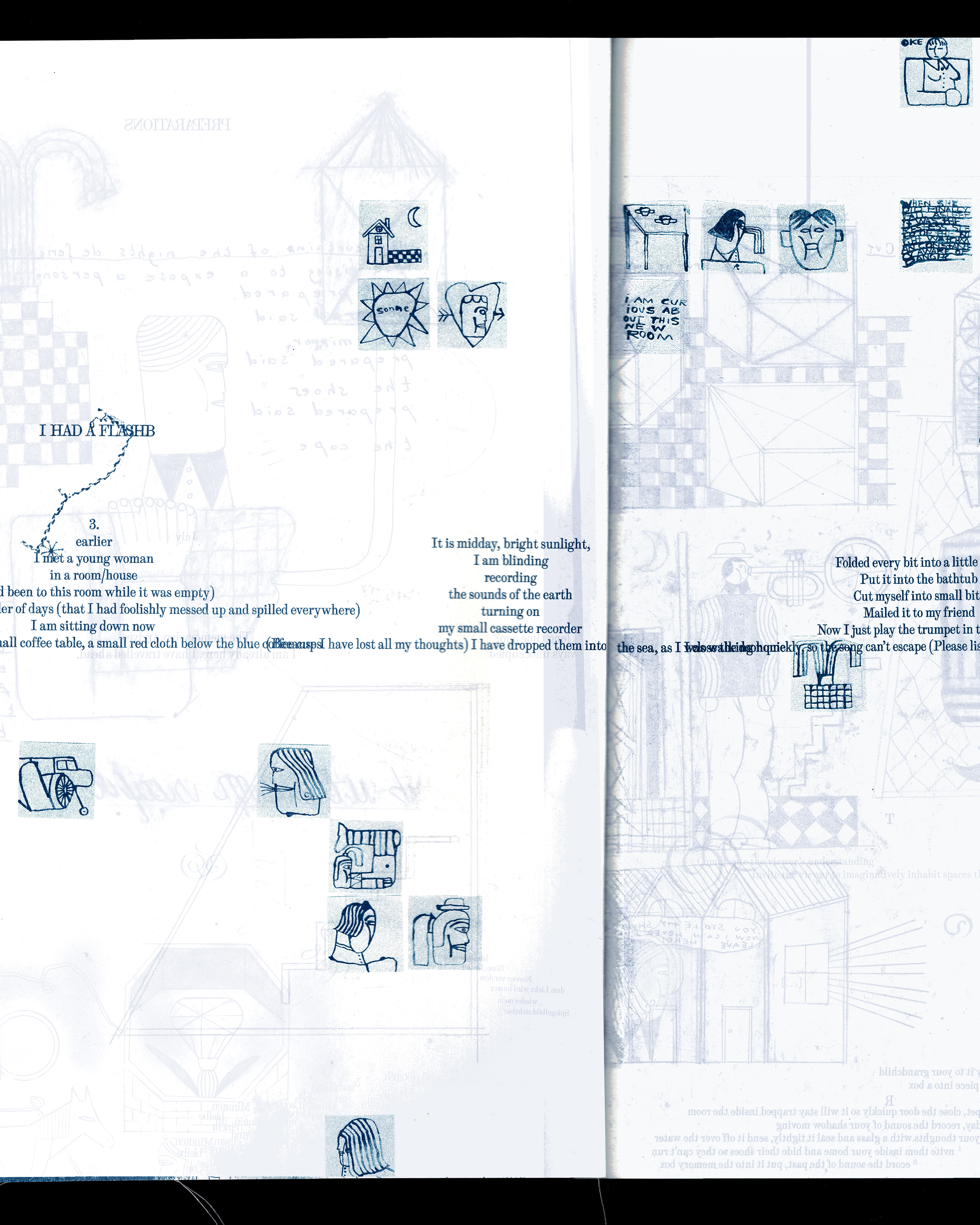
It builds on Sheila Levrant de Bretteville's idea of a fragmentary design organisation paralleling a woman's ontological experience, particularily her experience of time: The publication proritizes a non-hirarchal organisation, one of an assemblage of fragments pieced together. It draws from concepts of weaving and blankets in the sense that it does not pit drawing and typography against each other as antagonists, but rather allows the two media to interlock, meet, and intertwine with one another.
The project is grounded in this very encounter between drawing and typography, as well as between two artistic positions — those of typographer Marie Walser and drawer Luise Schaller — which respond to and shape each other.
What emerges is an open process of negotiation that weaves drawing, typography, and word into ever-new images, unbound by any concrete narrative. Instead, they create languages, images, and braids that spring from one another and continuously reshape each other.
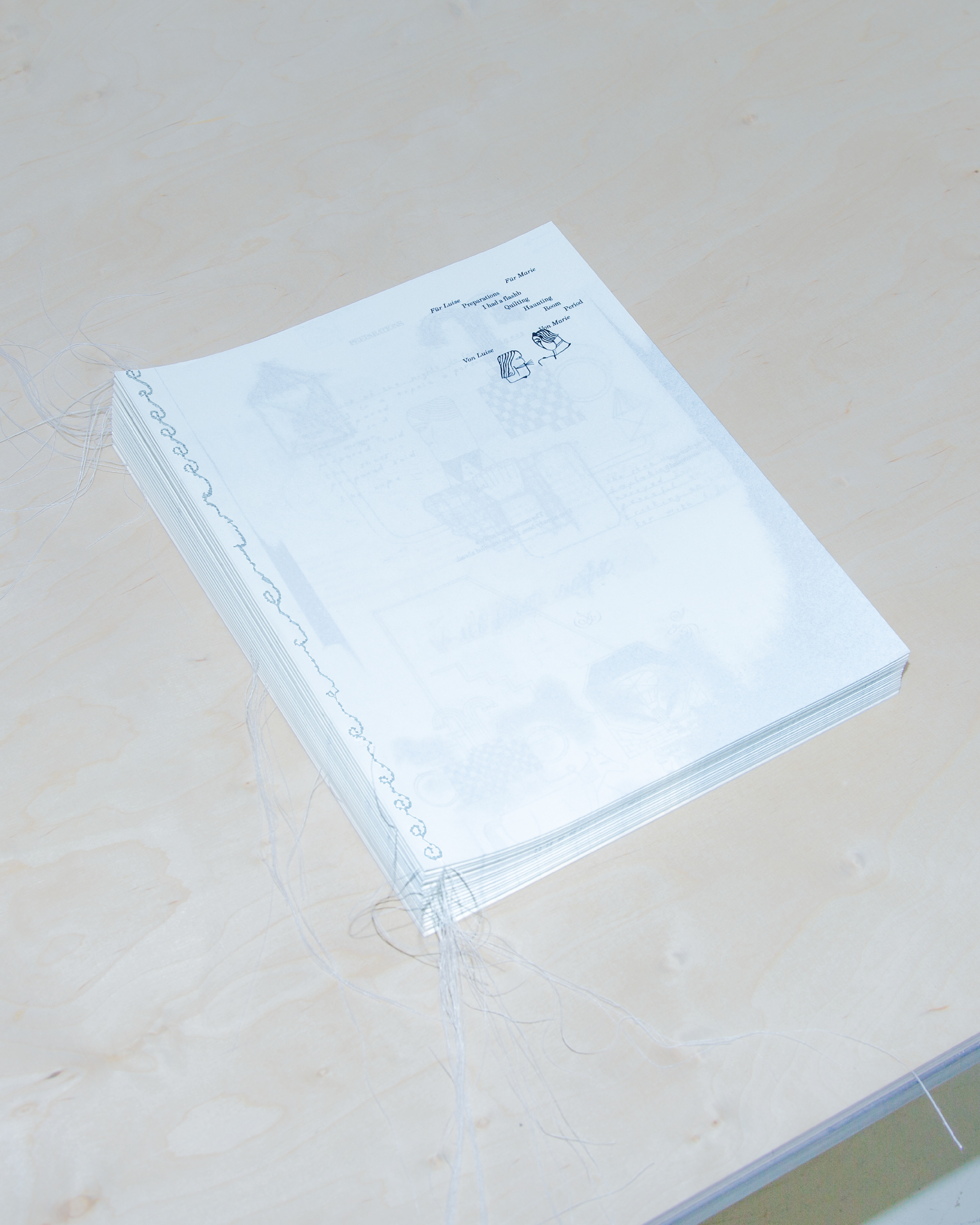
Born from friendship and a state of mutual interest and curious turning toward one another and each other’s practices, our process is rooted in the intimate exchange of diary excerpts, texts (both theoretical and poetic, self-authored and quoted), notes, and thoughts. The immediate insight into the other person’s experiences and interests revealed coincidental similarities, but also differences in our ways of thinking, note-taking, and working. The fragmentary textual portrait of the other person became material with which we began to work in our respective ways. Continuous exchange and mutual reworking of drafts and text fragments became our central method. Rather than pursuing a linear workflow or stringent narrative form, we sought a fragmented visual organization to capture a precise image of personal experience. An unstable landscape, a braid of two voices, was woven, with the spreads of the book unfolding on found textile, bed sheets and embroidery.
Wandering through dreams, fears, and observations, it is a thing as nebulous as it is precise.
Wandering through dreams, fears, and observations, it is a thing as nebulous as it is precise.
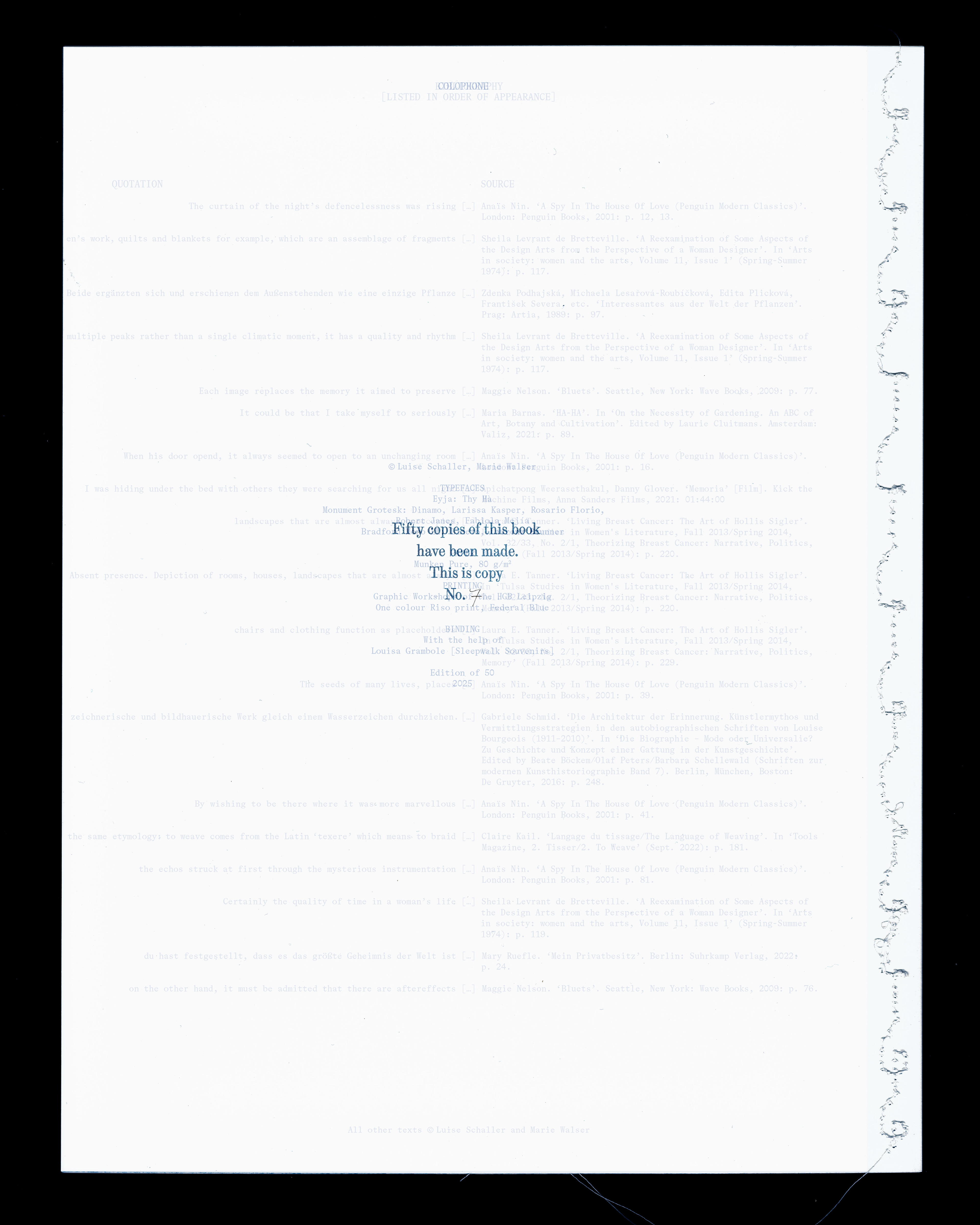
Book, edition of 50
Printed at the Graphic Workshops of the HGB Leipzig
One color Riso Print, Federal Blue on Munken Pure 80 g/m^2
Printed at the Graphic Workshops of the HGB Leipzig
One color Riso Print, Federal Blue on Munken Pure 80 g/m^2
Textile, edition of 2
Screen print on linen
Screen print on linen
Binding with help of Louisa Grambole
Typfaces in use: Eyja by Thy Há
Monument Grotesk by Dinamo Typefaces and Bradford Mono LL by Lineto
Monument Grotesk by Dinamo Typefaces and Bradford Mono LL by Lineto